
Typography is the art and science of how your text appears on your website. It’s not just about choosing a font—it’s about how that font is sized, spaced, aligned, and styled to create a clear, consistent, and enjoyable reading experience.
Typography includes:
- Font styles (like Arial, Roboto, Playfair Display)
- Font sizes (headlines, paragraphs, captions)
- Line spacing (how much vertical space between lines)
- Letter spacing (how tight or loose the letters are)
- Text alignment (left, center, right)
- Font weight (bold, light, regular)
- Text color and contrast
In other words: typography shapes how your message is delivered. Even with the best words, poor typography can make your content feel unprofessional or unreadable.
Why Typography Matters More Than You Think
1. It Affects Readability
If your text is too small, thin, crowded, or faint, people won’t read it. They’ll scroll past or leave your site. Good typography ensures visitors can easily absorb your message on any device.
2. It Influences Emotion and Brand Perception
Typography has personality. A clean sans-serif font feels modern and professional. A script font might feel elegant and creative. A bold, geometric font might feel techy or edgy. The fonts you use and how you use them quietly shape how visitors feel about your brand.
3. It Creates a Visual Hierarchy
Great typography helps users scan your content. Headings stand out. Subheadings organize sections. Body text reads smoothly. Calls to action pop off the page. This structure is essential for guiding your visitors through a page with clarity.
4. It Supports Accessibility
Accessible typography means using easy-to-read fonts, proper spacing, and high contrast between text and background. This ensures your content is usable for everyone, including those with visual impairments or reading challenges.
Key Typography Elements to Get Right
Here are some practical tips for small business sites:
- Font Pairing:
Stick to one or two fonts that complement each other (e.g., one for headings, one for body text). Avoid using too many fonts—it feels chaotic and confusing. - Font Size:
Body text should usually be at least 16px on desktop and readable on mobile. Headings should be larger and clearly defined in hierarchy (H1 > H2 > H3). - Line Spacing (Line Height):
Give your text room to breathe. A common setting is 1.4–1.6 times the font size. - Contrast:
Black on white is easy to read. Light gray on white? Not so much. Make sure your text color stands out from the background. - Alignment:
Left-aligned text is easiest to read in most languages. Avoid full-justified text—it can create awkward spacing.
What Typography Says About Your Brand
| Font Style | Feels Like |
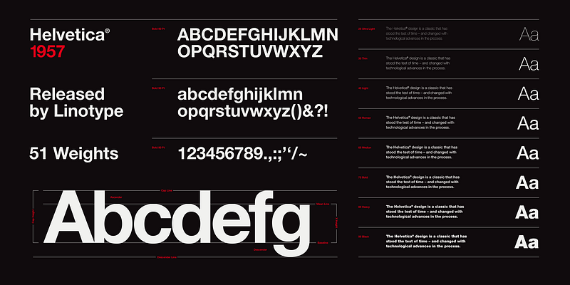
| Sans-serif (e.g., Helvetica, Open Sans) | Clean, modern, friendly |
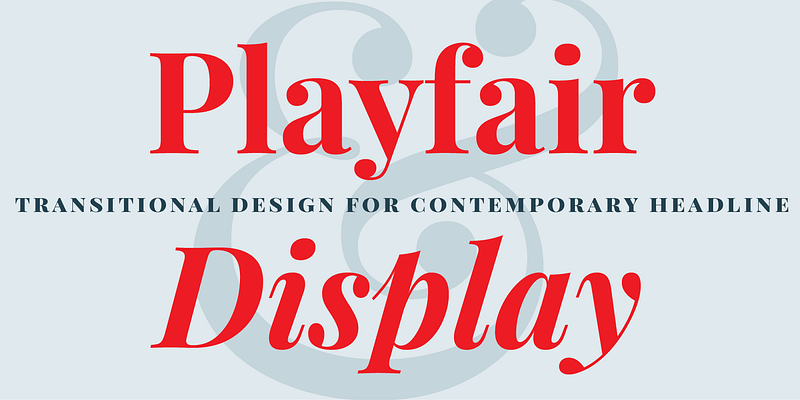
| Serif (e.g., Georgia, Playfair) | Elegant, formal, traditional |
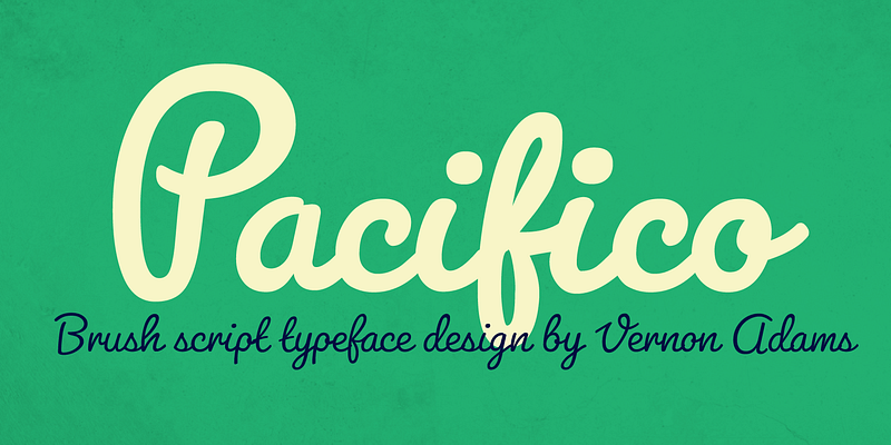
| Script (e.g., Pacifico) | Creative, feminine, personal |
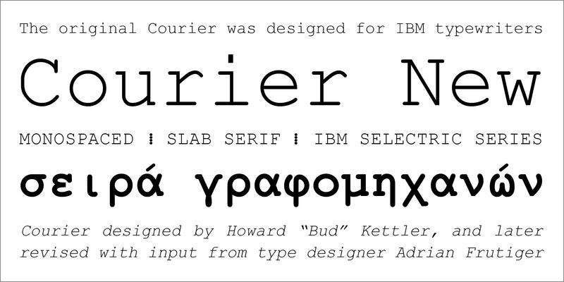
| Monospace (e.g., Courier) | Technical, coding-related |
Choosing the right typography isn’t about looking trendy—it’s about communicating your personality and values to your audience.
How WordPress Handles Typography
In WordPress, typography is often controlled through your:
- Theme settings – Most themes let you choose default fonts and sizes.
- Customizer or page builder – Tools like Elementor, Bricks, or Gutenberg give you visual control over typography.
- Plugins – Typography plugins let you load custom fonts or fine-tune styles (e.g., Easy Google Fonts).
Make sure your chosen theme or builder supports responsive typography, so text looks good on mobile and desktop.
How Vital WP Care Helps with Typography
At Vital WP Care, we regularly help clients:
- Choose fonts that reflect their brand
- Fix font inconsistencies across pages
- Improve readability for mobile users
- Set up a proper heading structure for SEO and UX
- Ensure accessibility and contrast compliance
Whether you’re starting from scratch or refining an existing design, we make sure your site is easy to read, visually consistent, and professionally styled.
TL;DR: Typography Is How Your Message Comes to Life
Typography is more than design—it’s how your words are experienced. The right fonts, sizes, and spacing help your visitors focus, understand, and trust what you’re saying. Bad typography? It’s like whispering into a megaphone—it confuses, distracts, and sends the wrong signals.
Your brand deserves to be heard clearly. And your website deserves typography that works just as hard as your content does.